Blog
Designing the reading experience: a story does not end when it is generated
Creating a story is only the beginning: how we designed Buklea's reading experience for mobile, tablet, audio, print and physical books.
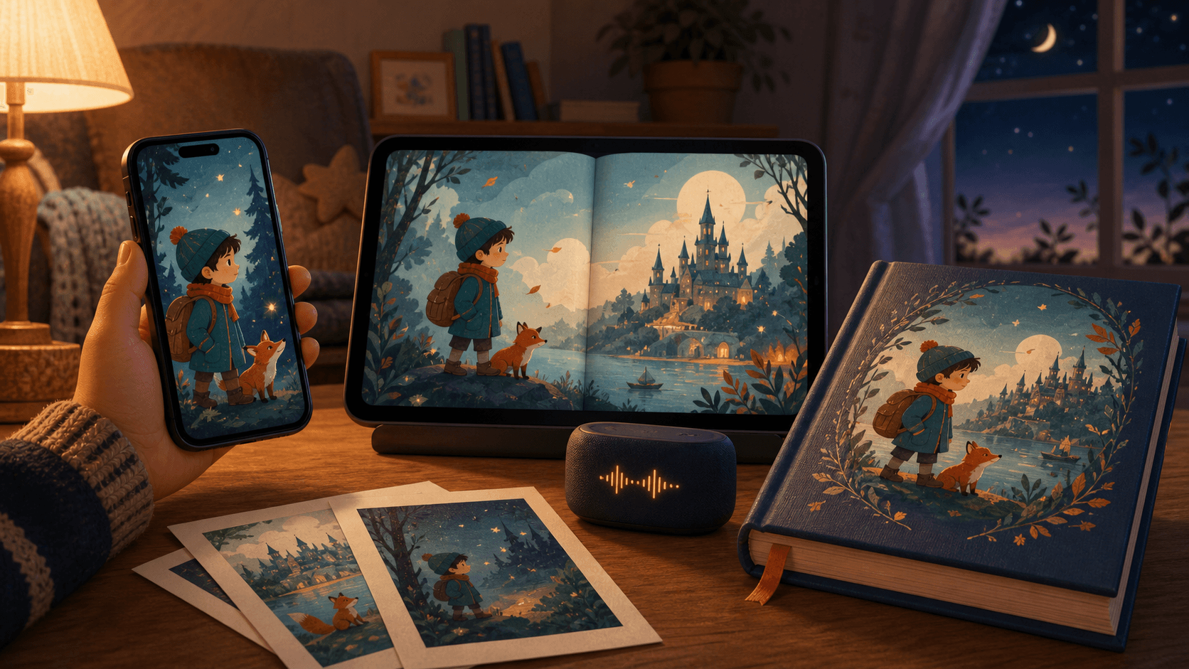
In previous articles in this series, I explained why the hard part of building Buklea is not generating an image and explored one of its most visible challenges: maintaining visual consistency throughout an entire story. The Buklea project page shows the product these decisions belong to.
But even if we create a good story, compelling illustrations and recognizable characters from beginning to end, a more important question still remains:
How will the family receiving that story experience it?
Generating a story and designing a reading experience are different problems. The first ends when the content is ready. The second starts precisely there.
There is no single way for a family to read
When we talk about user experience, we tend to think about screens, buttons, flows and loading times. For a children's product, the frame needs to be wider. The experience does not belong only to the child, and it does not always happen inside the application.
It might be a father reading from his phone before bedtime. A child turning pages on a tablet. Two siblings looking at a story on a computer. A mother starting the narration because the youngest cannot read yet. Or a family that prefers to print the story and turn off the screen.
All of these situations are part of the same product.
That is why, at Buklea, we did not want to treat reading as a responsive screen that simply changes size. We wanted to think about different reading moments, each with its own posture, distance and form of interaction.
Portrait: start with what is already in your hand
A phone in portrait orientation is probably the most immediate entry point. It requires no setup and no change in how the device is held. A family can open the story quickly, hold it with one hand and move forward with familiar gestures.
That convenience also creates constraints. There is less space to combine text and illustration, attention is focused on a smaller area, and navigation controls can compete with the content.
The answer is not to shrink the desktop page. The hierarchy needs to remain clear: what is read first, how much text appears, how the illustration stays visible and where controls sit so they do not interrupt the rhythm.
In portrait, the priority is reducing the friction of getting started. Opening a story and beginning to read should take as little effort as possible.
Landscape: closer to the language of a book
When a phone or tablet rotates, the experience changes. Landscape resembles a two-page spread and lets text and image share the space more naturally.
Here, the page-turn animation is not just decoration. It preserves a spatial reference: the family understands that they are moving through a story, not jumping between independent screens.
That detail matters especially in a children's experience. Movement should support reading rather than demand attention for itself. A transition that is too slow breaks the rhythm; one that is too conspicuous competes with the illustration; an instant change can lose the sense of continuity.
The goal is for the interface to disappear, leaving only the familiar gesture of turning a page.
Desktop or tablet: reading together changes the design too
A larger screen does more than display larger elements. It also changes the relationship between people and the device.
On a computer or a propped-up tablet, reading can be shared. There is no longer necessarily one person holding the screen. An adult might be narrating, a child looking at the illustrations and someone else joining the conversation.
This means keeping text legible from farther away, giving illustrations more prominence and avoiding small controls designed only for individual interaction. The experience must work when nobody is viewing the interface from twenty centimetres away.
Designing for desktop or tablet is, in part, designing for a more social kind of reading.
Narration is not an extra
Not every child who enjoys a story can read yet. Others are learning, tire quickly or need support to follow the text. Narration should therefore not be treated as a secondary feature added at the end.
Audio lets younger children enter the story before they can read on their own. It also helps parents start a story when they cannot lead a complete reading session at that moment.
The important design decision is to preserve control. It should be clear when narration is active, how to pause it and which page is being heard. Audio should accompany the story without turning the experience into a passive video.
Listening does not necessarily replace reading. It can be the doorway into it.
Designing for turning the screen off
There is an obvious tension in a digital children's product: we want to use technology to create and personalize stories, but not every family wants reading time to depend on a screen.
Instead of ignoring that preference, we decided to include it in the experience.
Buklea can generate a printable version of a story to prepare at home. Before creating the PDF, the application provides guidance about the process. That preliminary step may seem small, but it prevents frustration later: printing with the wrong settings, not understanding how to arrange the pages or realizing too late that an adjustment was missing.
A good printing experience does not end at the “Generate PDF” button. It should accompany the family from intention to finished object:
- briefly explain what they will receive;
- anticipate printing decisions;
- generate a file prepared for home use;
- preserve page order and continuity;
- reduce uncertainty before paper and ink are spent.
The interface has done its job when it gets out of the way and leaves a story on the table.
From a PDF to a book that lasts
The printable version answers an immediate need: bringing the story onto paper at home. A physical hardcover edition offers a different kind of value.
A well-made book can be kept, given as a gift, placed on a shelf and rediscovered years later. In a personalized story, that permanence carries particular weight. It is not merely a more durable way to consume the same content; it turns a digital experience into a family keepsake.
That is why both options make sense together. Not every story needs to become a physical book, and not every family wants to print at home. The experience improves when it offers different paths without presenting one as the right one.
Consistency across formats, not sameness
Designing several ways to read does not mean forcing all of them to behave identically.
Portrait can prioritize speed. Landscape can reinforce the page-turning gesture. A larger screen can support shared reading. Narration can lower barriers to access. A PDF can help families disconnect. A hardcover can offer permanence.
What must remain is the continuity of the story:
- the same narrative order;
- the same visual identity;
- predictable navigation;
- recognizable controls;
- a clear transition between reading, listening and printing.
Consistency does not mean copying exactly the same interface everywhere. It means making the family feel that they are still inside the same story.
What is worth observing and measuring
The reading experience cannot be validated only by checking that the screens work. We also need to observe what happens around them.
Some useful questions are:
- How long does it take a family to begin reading after opening a story?
- Do children understand how to move forward and back?
- Does rotating between portrait and landscape preserve their place?
- Does narration make it clear which part of the story is being heard?
- Can adults find the print option when they need it?
- Do the instructions help them produce the PDF correctly on the first attempt?
- Does a larger screen actually make it easier for several people to share the story?
- Does the family return to the story after the first reading?
Interface metrics are necessary, but they are not enough. A story can have a perfect completion rate and still fail to create conversation, curiosity or a desire to open it again.
Technology should expand the reading moment
The reading experience carries the same principle we apply to visual consistency beyond the illustrations themselves.
It is not enough for the character to remain the same. The story also needs to retain its meaning when the device changes, when it is heard rather than read, or when it leaves the screen and becomes paper.
The challenge was not to create another screen for children. It was to create more opportunities for a family to share a story.
Have a project in mind?
Let’s turn your idea into a product that works
If this article connects with a challenge you are facing, tell me about the context. I’ll reply with a clear first assessment and sensible next steps.